

Oct
19
2012
19
2012
Oct 19 2012
little bit of leopard

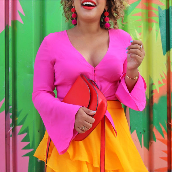
let’s talk leopard… && pair this puurrfect print with a cute contrasting color combo


reds && blues make a great color combo && any shade will work. here i went for a deeper teal blue with a bright candy apple red, but turquoise && red orange also work really well together!


when you are working with a contrasting color combo, just try to keep the rest of the outfit neutral with golds, nudes or black && white. but don’t be afraid to spice it all up with a little bit of leopard 


sweater: kate spade (i scored this little lady for a steal at the ksny palm springs outlet earlier this week) (here’s this year’s version) // skirt: h&m // pumps: kate spade (only in stores) // purse: kate spade (another outlet steal) // necklace: francescas // belt: kate spade (similar) // rings: kate spade // forever 21 (old) // arm party: sequin // kate spade (similar) // sequin // kate spade (old) // michael kors // kate spade


SHARE OR SAVE FOR LATER
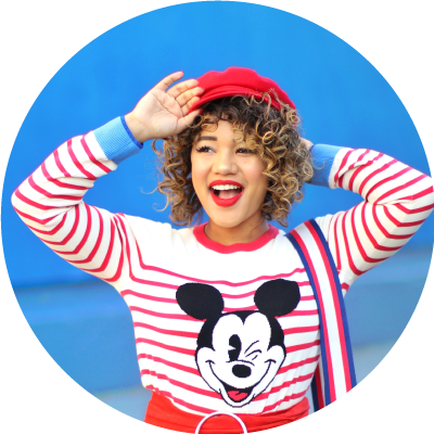
Hey girl hey..
I’m Courtney - a bright minded New Yorker with a serious sweet tooth a slight color obsession ;). Welcome to my world (and wardrobe) where I mix my matches, live colorfully & always dress outside the lines ! learn more >>
Browse by Category

<!– COLLECTIVE WIDGET CODE START
–>
<!– COLLECTIVE WIDGET CODE END
–>
Press Play

Comments