

Aug
7
2018
7
2018
Aug 7 2018
Blue,
I’ve Got The Blues
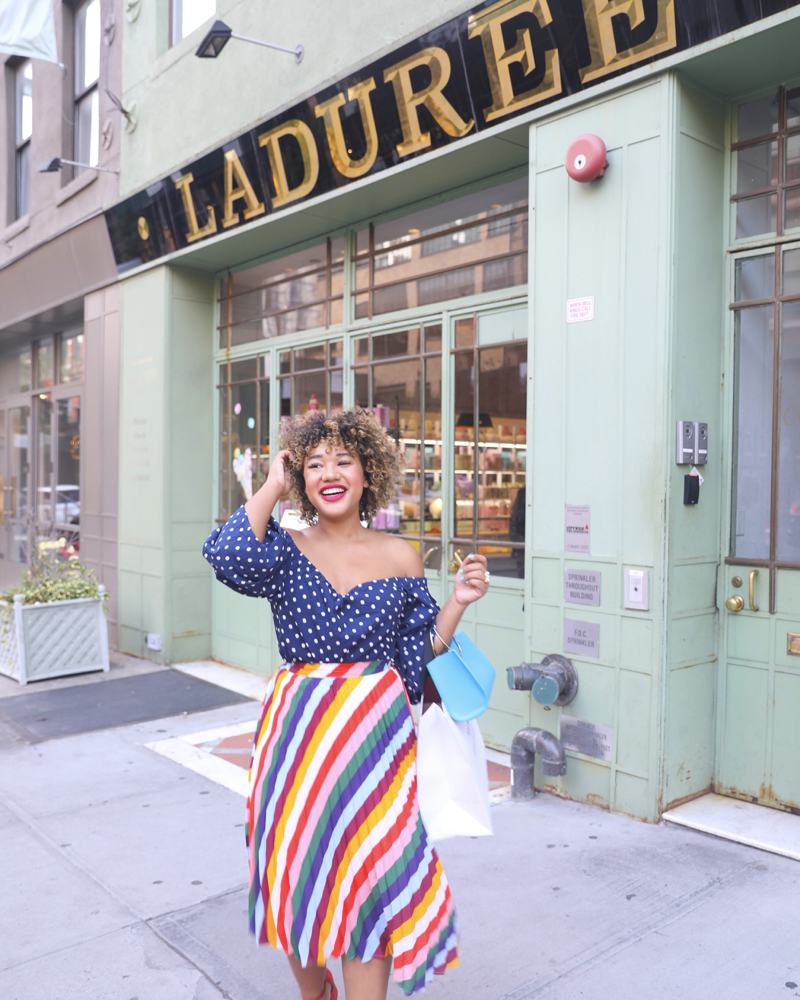
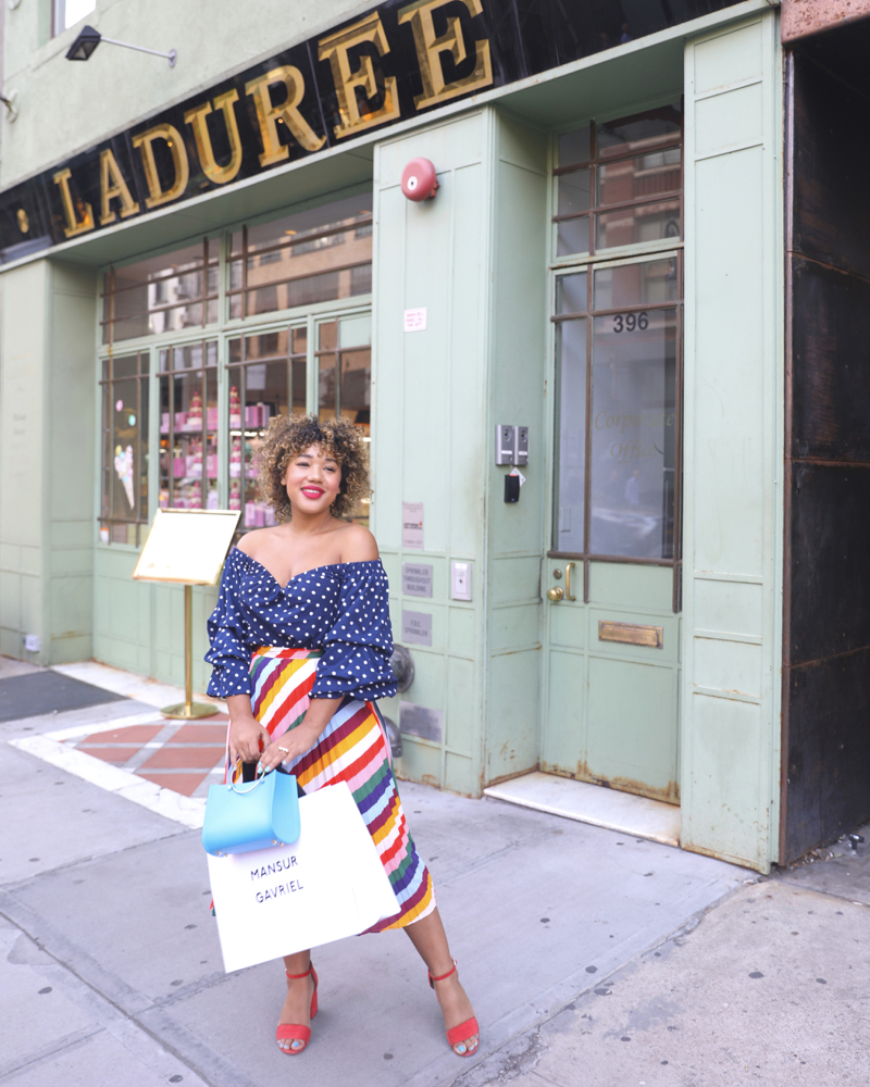
If you read yesterdays post, you now know the secret I’ve been keeping all month long about the color of the month, and today as promised I’m sharing 5 things I learned from my month of blue + this look where I’m actually wearing navy (GHASP).
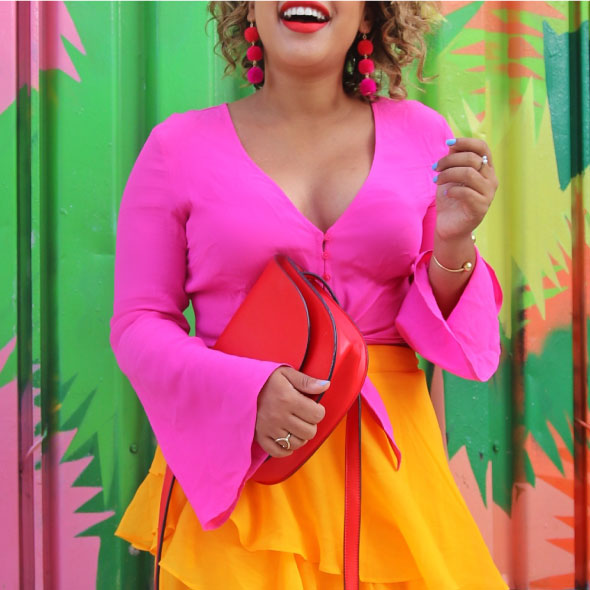
SHOP: Top $28 || Plus Top $25.20 || Skirt $22.90 || Plus Skirt $21.99 || Bag $245
1 Blue is one shady lady – Although I generally don’t like the color blue, I do like how versatile she is. Navy, baby, Tiffany, turquoise, teal, Royal, Caribbean, Cornflower, this girl is all over the place, in a good way! I used this color chart as a reference point for kicking off the month of color, it kept me inspired when I was feeling really blah about blue.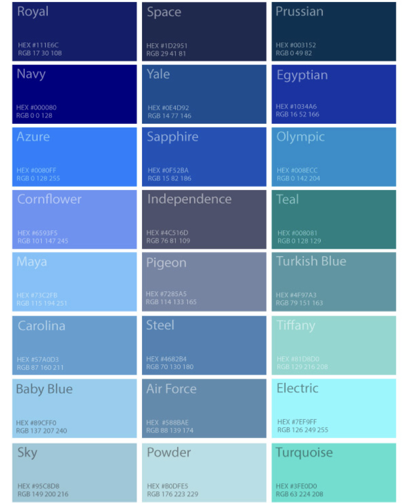
2 Blue goes with everything – Blue really works with everything so I got to get creative with color combos, here are a few favorites:
Electric + Yellow // Azure + Cherry // Egyptian + Kelly // Azure + Mac & Cheese // Sapphire + Hot Pink //
// Cornflower + Coral Red ; also here // Teal + Blush + Hot Pink // Maya + Olympic + Cherry //Cornflower + Kelly Green // Navy/Royal + Orange // Mango + Cornflower
3 Blue does it better – In yesterdays post I touched upon the idea that blue photos perform better. I’ve heard everyone say this from big youtube stars with a great presence on the platform to social media experts who are sharing their insights. I wondered if this was true so I wanted to put it to they test. Long story short, they were right. Blue photos do perform a bit better than my typical red, yellow & pink ones and here’s is why I think thats true. My photos are more colorful than the average instagram photo, so if you think of it from a. Follower perspective you’re scrolling through a feed of filtered & muted photos to see mine, they’re going to be shocking bright in contrast. I think that can be distracting and prevent people from engaging, but a bold blue photo while still colorful is a better transition from the toned down color pallet you’re used to seeing in a feed. It stands out, but in a less obnoxious and obvious way. Which leads me to the second reason, blue is a calming color. They say you’re not supposed to paint your bedroom a warm color (I actually just painted my bedroom on Monday and totally broke this rule, oops) because it will amp you up instead of calm you down. Blue is soothing and I think my use of bright blues can be the perfect combination: colorful and fun, while being grounding and relatable. The third reason I think they performed better is because most people like blue, if you like color you usually like blue, if you don’t like color you usually like blue; it’s most peoples favorite color and generally everyone can see a blue outfit and relate to or want that look, so naturally the photos performed better because they’re less polarizing than my typical rainbow photo. And finally, photo quality: because I was a little less inspired by blue as a hue, I had to work harder to create great content. I shared on Sunday via instagram hat 9/10 of my previous posts where photos of me eating which happened because I didn’t;t want a boring photo. Me twirling in a blue outfit with a bright background wasn’t enough for me this month, I wanted each photo to showcase movements, real life moments and more than just the color blue. A photo that would have been feed-worthy in a warm tone didn’t make the cut in this cooler hue so I pushed the envelope more with my photos, delivering shots like this that were unique, true to my brand, utilized blue in expected ways and ultimately performed really well!
Here are some of my top performing blue photos of the month, for reference I usually average about 10K likes 100 ish comments, in some of these photos I got double that or more in terms of likes and comments. Also if you’re reading this and you aren’t someone who comments on my instagram photos, please do! Thats how I get visibility to you and get to know you as a follower. I have people who DM me every day but never comment, I get over 500 dms a day and cant keep up with them anymore they get so overwhelming sometimes I dont check them for days but I always check my comments and I try to respond. My goal starting in august is to turn off my DM story responses and use comments / emails as the main way to communicate with you guys! Also its a great way to meet other cuties, so many of you have connected with like minded people through the comments which is like my dream come true – anyways, back to the posts.
Top performing posts:
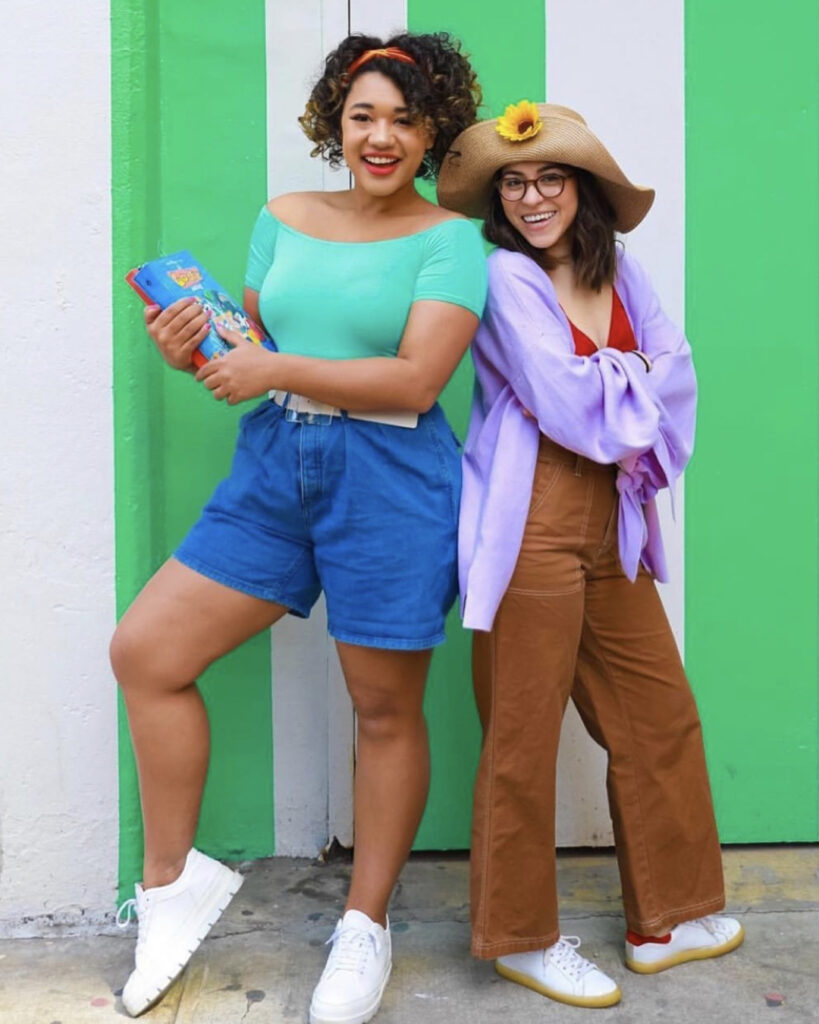
This photo is one from last year – when I shared a different version of the same shot last year it became one of my top 25 performing shots of the year. I think its a very simple outfit and photo, more on the toned down side for me but I think thats why so many people liked it both last year and this year.
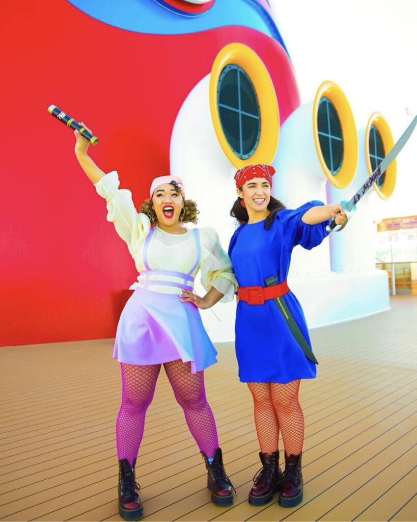
#courtneyandparis photos always perform better than just Courtney photos and Paris won’t let me forget it. This one was no exception but to be fair I’m not sure thats because its blue, it has other things going for it that help deliver a good photo engagement wise: A unexpected lifestyle moment (stoop picnic), matching outfits, two people instead of just one, a colorful door (everyone loves a good door) & a wedding update. What do you think, was it the color or the photo or a combo of both that caused this one to perfom better?
This pic became my top performing one of the month delivering ton of likes and comments and getting picked up on the explore page ultimately delivering me more followers too! I think its a winner because of the ice cream wow factor, but the color, the outfit, the composition, the fact that I’m in motion about to drop my ice cream on Paris all make for a good photo – oh and it was on national ice cream day!
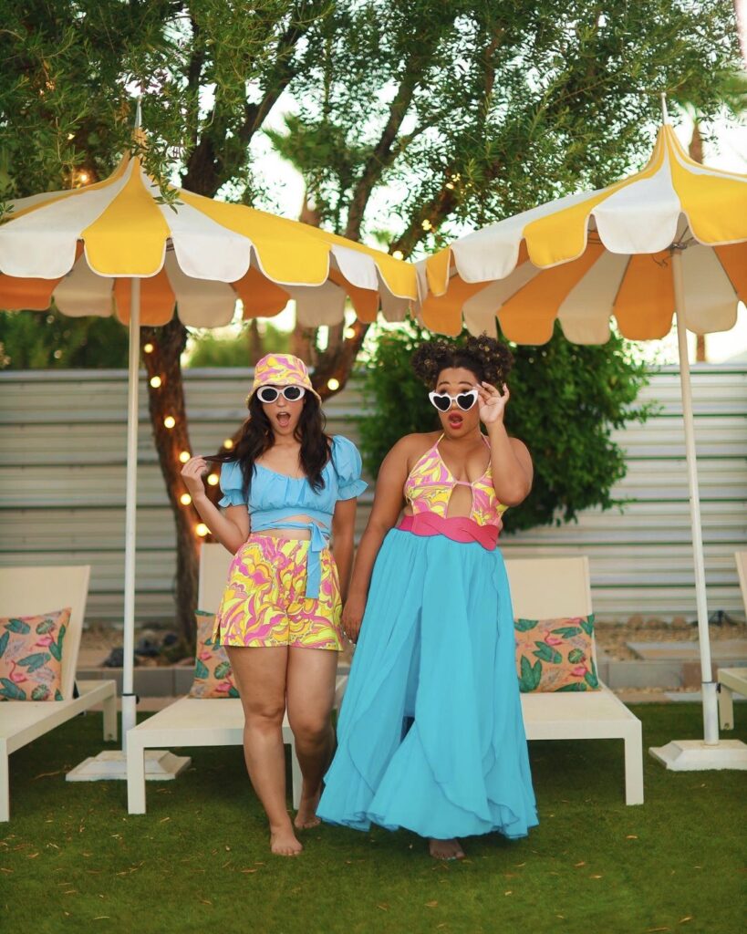
This pic is the expiation to the rule – its more true to what I usually post, warmer, rainbow, and not much blue in sight. I had already posts a shot from this shoot in June so it wasn’t a totally new moment either, and yet it was one of the months top performing posts. So does that mean that blue isn’t the reason some of these other photos performed better? Or is it because I used so much blue this month it stood out? I’m not sure but I do think that this one performed better because it was a cool and unique shot took in Nice with one of my favorite dresses, I’m not sure the warm or cool tone had a say here – but that’s just my guess.
This photo is pretty simple and kind of boring for me, and yet its another top performer. Maybe because its me doing something bland like picking out paint colors but having fun with. I have no make up on and no bra, so its more of a real life moment and less of a photoshoot so I think people like that.
Bathing suit + the color blue + body positive message = winning photo ! this shot (1) & this shot (2) both performed in the engagement department. They have me more insights how the color blue performs because I had shared them on the blog about a month ago. In June I did a bunch of swimwear posts, so I knew how they performed. These two did slightly above average for swimwear and almost double the engagement of a normal photo.
4 Temperature Down, Saturation Up – So I edit my photos all on my phone (blog too) on snapseed. I don’t use photoshop or Lightroom and I don’t have one filter I use for all my shots. I edit each one of them individually which takes a lot of time that I don’t necessary have, but it’s important to me. I want the colors to be true to what they were, but just brighter, bolder and more elevated. A lot of filters can change colors making baby blue’s turn aqua and since I’m selling clothes and color I don’t want to do that, I would hate for you to buy something you saw on me only to find out its a completely different color. So editing mostly blue photos was different and I had to alter my style accordingly. When I open a photo on snapseed (its free In the App Store) I usually pulll up the ambiance, then saturation, then brightness somewhere in between 10 to 30 % before increasing the warmth of the photos in temperature and then going in using selective edit. For my blue photos to keep them on the cooler side but still wanted to make them pop, so I stumbled upon the winning combo of temperature down (cooling down the photo and making it more blue) + saturation up. Instead of using ambiance as much as I usually do, I would cool down the photo with temperature first which made me blues bluer and the photo cooler, but also my skin grayer. To offset this, I would amp up the saturation which would bring my skin back to its natural color and make the photos pop. I also used filters very sparingly, trying some of the cooler ones in A Color Story at 5%, I even downloaded VSCO for the first time ever and used some the S and V filters to bright out the background blues a bit without altering me or my outfit.
5 It’s good to feel uncomfortable – The final thing I learned this month is to get over my fear of the fear of blue. What I mean by that, is learned that I’m more scared of the fact that I don’t love wearing this color that everyone loves, than I am scared of actually wearing it – If that makes sense. So many times any fear or anxiety we have of a situation isn’t tied to that specific situation itself but rather how we deal with it, or how we think others will think of us when dealing with it which is crazy because then it shifts the fear of what you’re originally afraid of. Watching myself do this to something simple like a color all month long gave me insight into how I deal with every day anxieties and pushing myself through things I don’t like to do, where blue. It made me realize having to do something every day that you usually wouldn’t can help you grow and made me want to challenge myself to do a month or more things I hate: like maybe a month of yoga everyday (guys I hate yoga, its so boring I just cant), or a month of eating breakfast – again, I hate breakfast I don’t like eating right when I wake up and usually don’t until lunch. I learned to get over my shame of not liking this shade, and my fear of getting judged when I shared it. It the end it sounds silly that I was scared to wear blue for a month and more scared to tell you about it, which put a lot of my general fears and anxieties into perspective. When you face them, write them down or say them out loud you take the power away and they aren’t so scary after all.
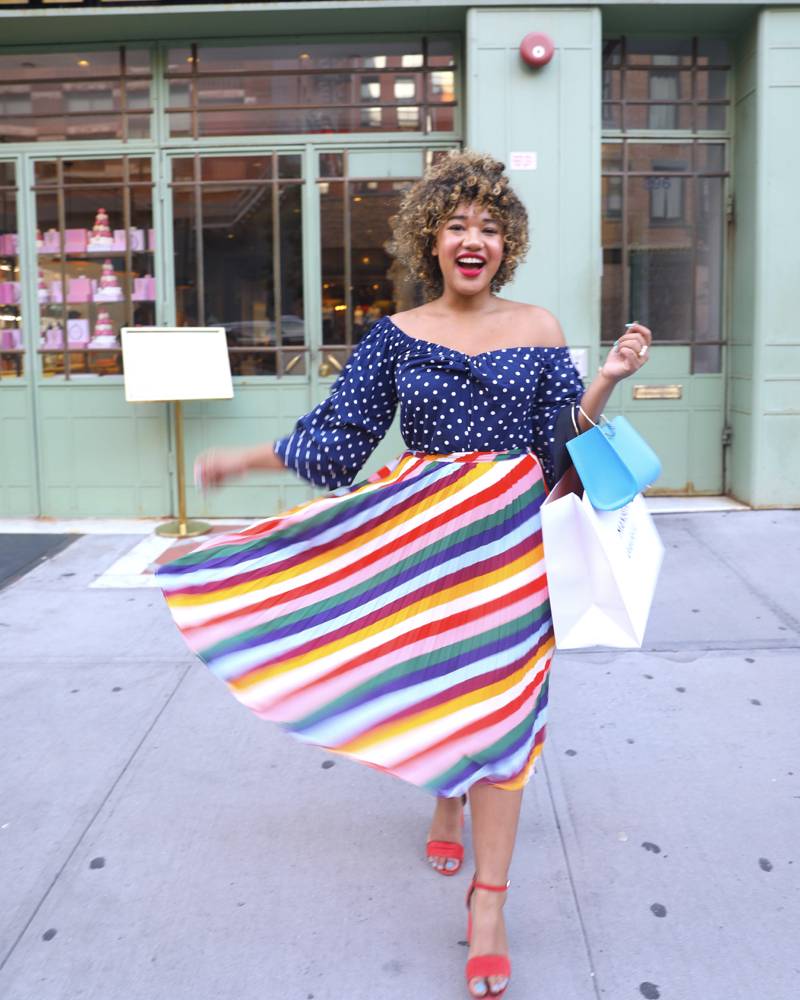
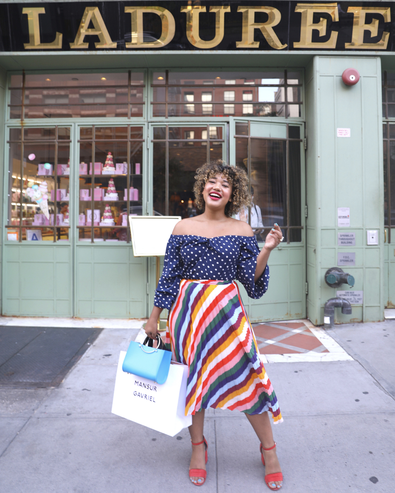
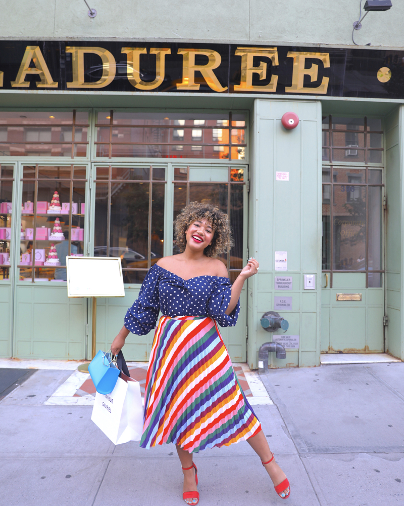 So I don’t really like navy, I think she’s the most boring of the blues but I wanted to challenge myself to make it ME so I’m doing the most for this look. Pattern mixing, rainbow, off the shoulder, polka dots and DRAMA!
Shop the look here:
TOP: Exact Match $28 || Exact Match, Plus $25.20
SKIRT: Exact Match $22.90 || Plus Skirt $21.99 || Plus Skirt $59
BAG: Exact Match $245 || Exact Match Teal $245 || Look for less $95
Hope you liked this look at what I learned in this month of blue, I’m announcing the new color for august on Thursday – yay!!
SHARE OR SAVE FOR LATER
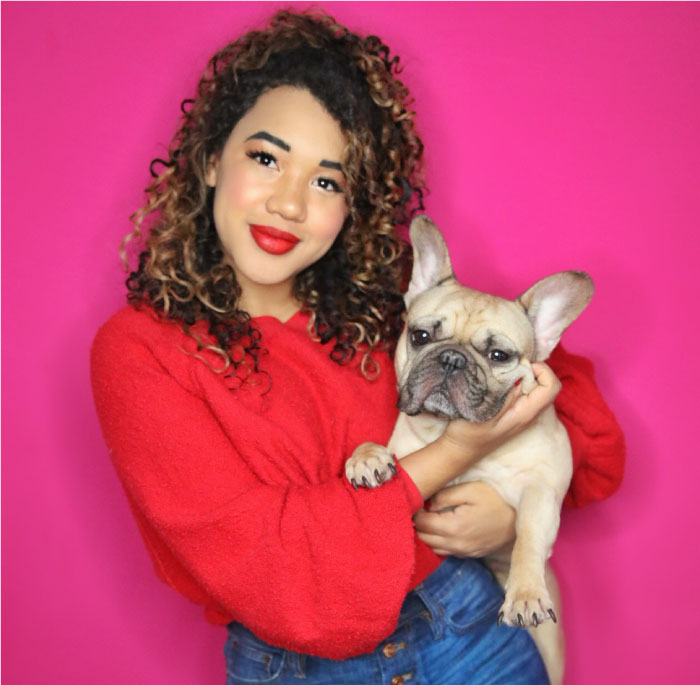
Hey girl hey..
I’m Courtney - a bright minded New Yorker with a serious sweet tooth a slight color obsession ;). Welcome to my world (and wardrobe) where I mix my matches, live colorfully & always dress outside the lines ! learn more >>
Browse by Category
<!– COLLECTIVE WIDGET CODE START
–>
<!– COLLECTIVE WIDGET CODE END
–>
Press Play

Comments